
A mobile app helping family caregivers prepare for medical appointments, capture visit summaries, and hand off to each other
Role
End to End UX Designer
Tools
Figma, FigJam, Google Workspace
Timeline
4 Weeks
The Problem
No one built a tool for the caregiver handoff.
When caregiving responsibilities rotate across multiple family members, medical visit information disappears. Each person who attends an appointment starts from zero. There is no shared record, no handoff, no system. There’s just scattered texts, forgotten details, and a growing gap between the people caring for the same person.
This is not a technology problem. It is a design problem. No existing tool was built specifically for the caregiver-to-caregiver handoff.
The Solution
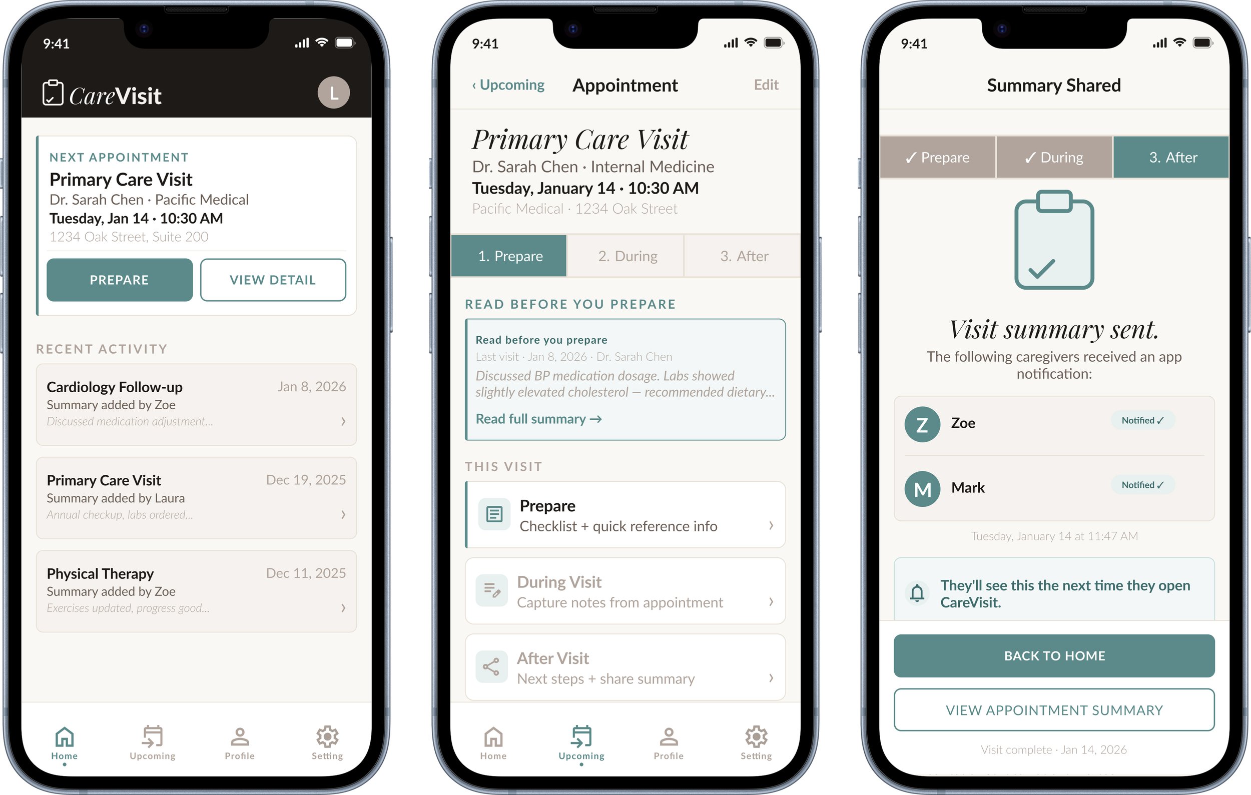
A three stage mobile workflow, (Prepare, During, After), that gives every caregiver the context they need before a visit, a way to capture notes during or after, and a single tap tonotify family when it is done.
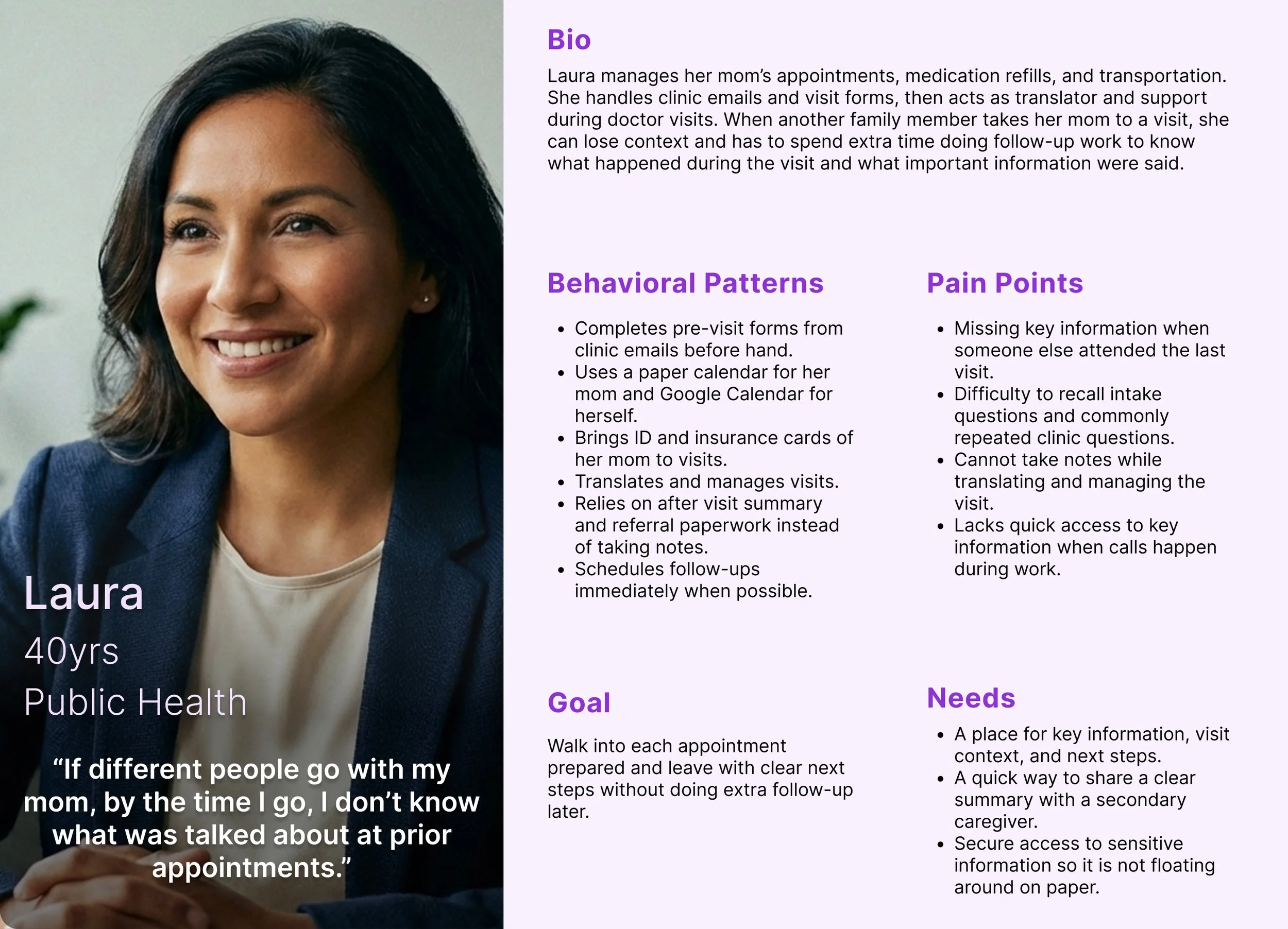
"By the time I go, I don't know what was talked about at prior appointments."
Laura, Coordinating Caregiver
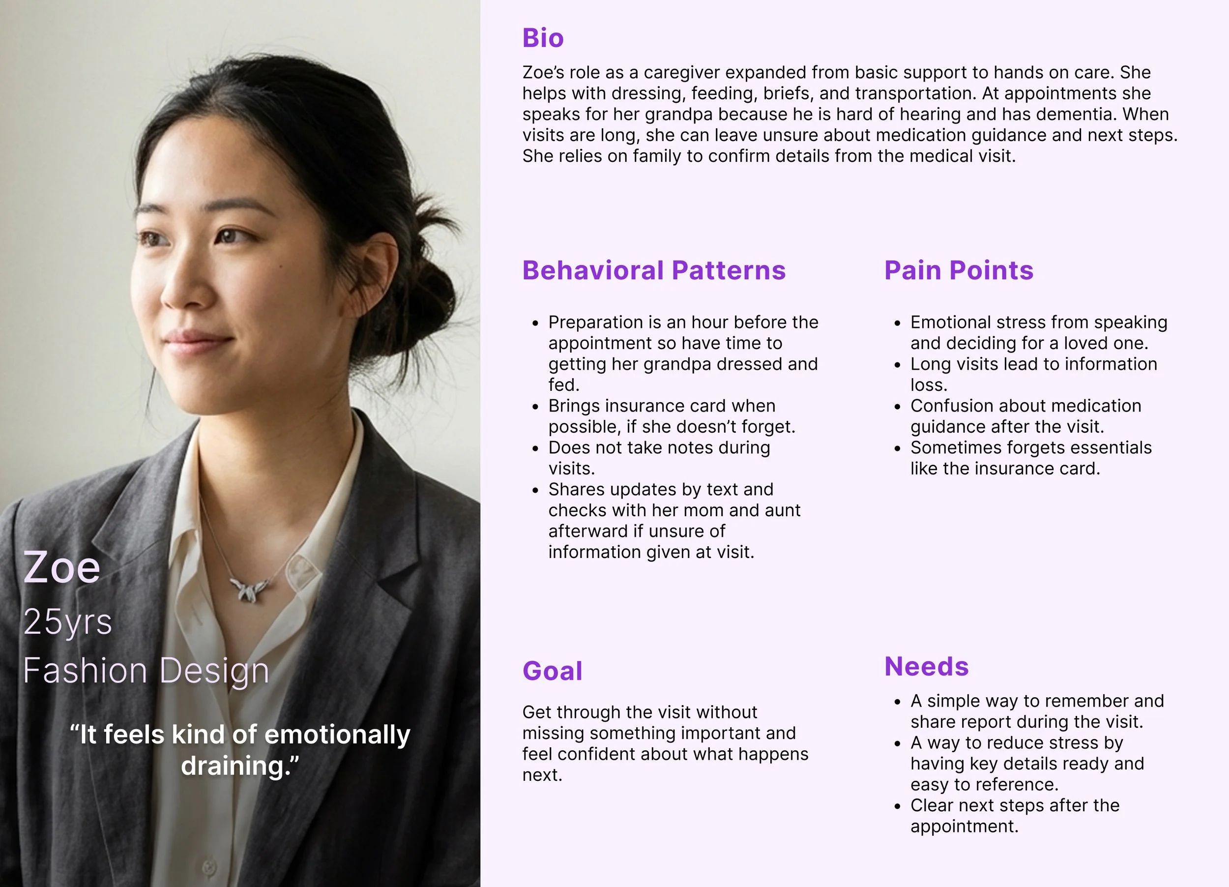
When appointments are really long and there's a lot to take in, some things do get lost."
Zoe, Secondary Caregiver
These are not the same problem but they are connected. The product had to solve both.
$3.2M
ARR. est.
Estimated · AARP 2023 Caregiving Report
0.1% of 53M US caregivers at $4.99/mo
2.7 hrs
per/yr
Per caregiver in prep and coordination time
Estimated from research interviews
+17%
task success
68% → 85%+ after one iteration round
Projected from post-fix design analysis
User Research
5 interviews. 5 clear patterns.
Conducted pre-interview survey followed by interviews with active family caregivers. They consisted of primary coordinators, secondary caregivers, and a care recipient. Participants ranged from 24 to 79 years old.
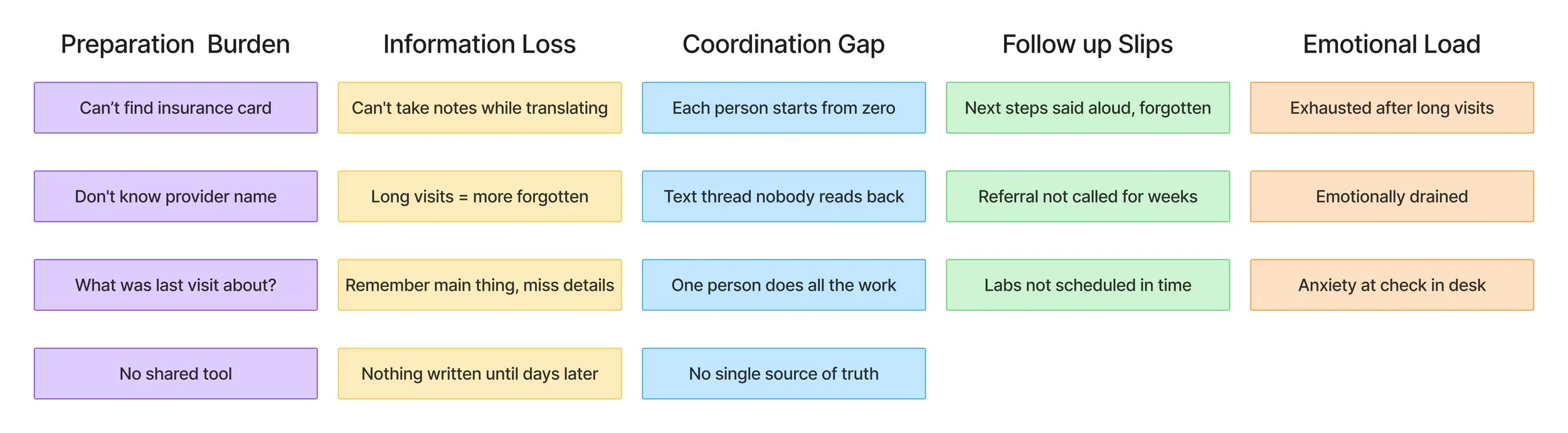
Prep is logistical, not medical
Caregivers scrambled for insurance cards, provider names, and prior visit context. Not clinical knowledge.
Follow ups slip after visits
Next steps texted immediately after then forgotten within days. No shared tracking existed.
Makes note-taking impossible
Acting as translator meant losing information afterward from divided attention.
Design constraint is emotional
Any solution needed minimal effort in the moments that matter, during and immediately after.
From quote to feature
Every design decision traces back to something a real person said.
Nothing is shared or consistent
Information stays across paper, texts, and memory. No tool was built for the family caregiver.
The north star
Every feature evaluated against: does this solve what Laura or Zoe described in their own words?
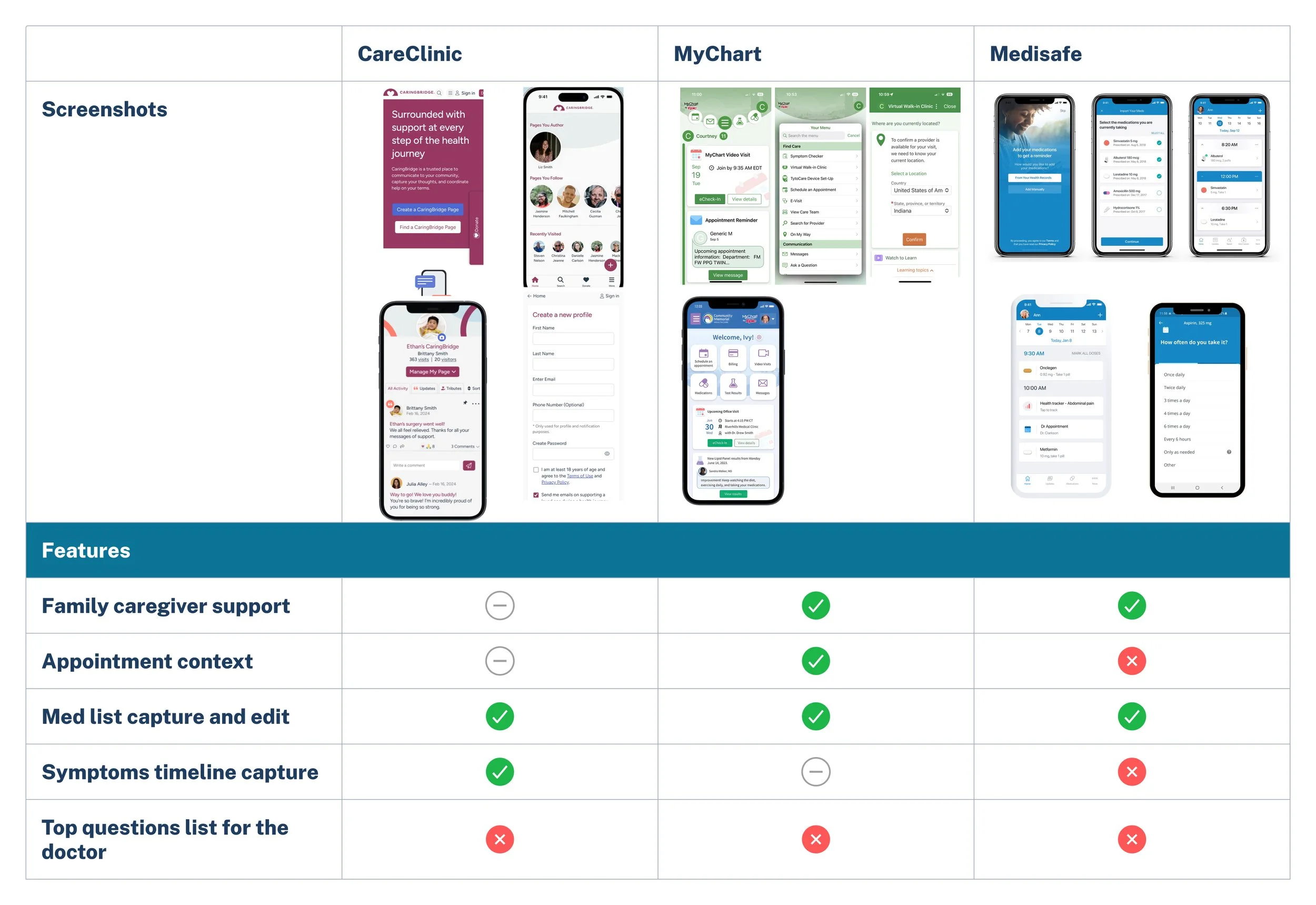
Competitive Analysis
No existing tool was built for the family caregiver to caregiver handoff.
Define
Two users. One productive tension.
Laura needed structure and context. Zoe needed speed and zero pressure. The tension between them made the product stronger.
User and Business Goals
Aligning Needs with Growth
In order to further understand the users, I looked at the problem from three angles, business, technical, and user. This allowed me a deeper guide on priorities to each department and how to approach their shared goals within my design.

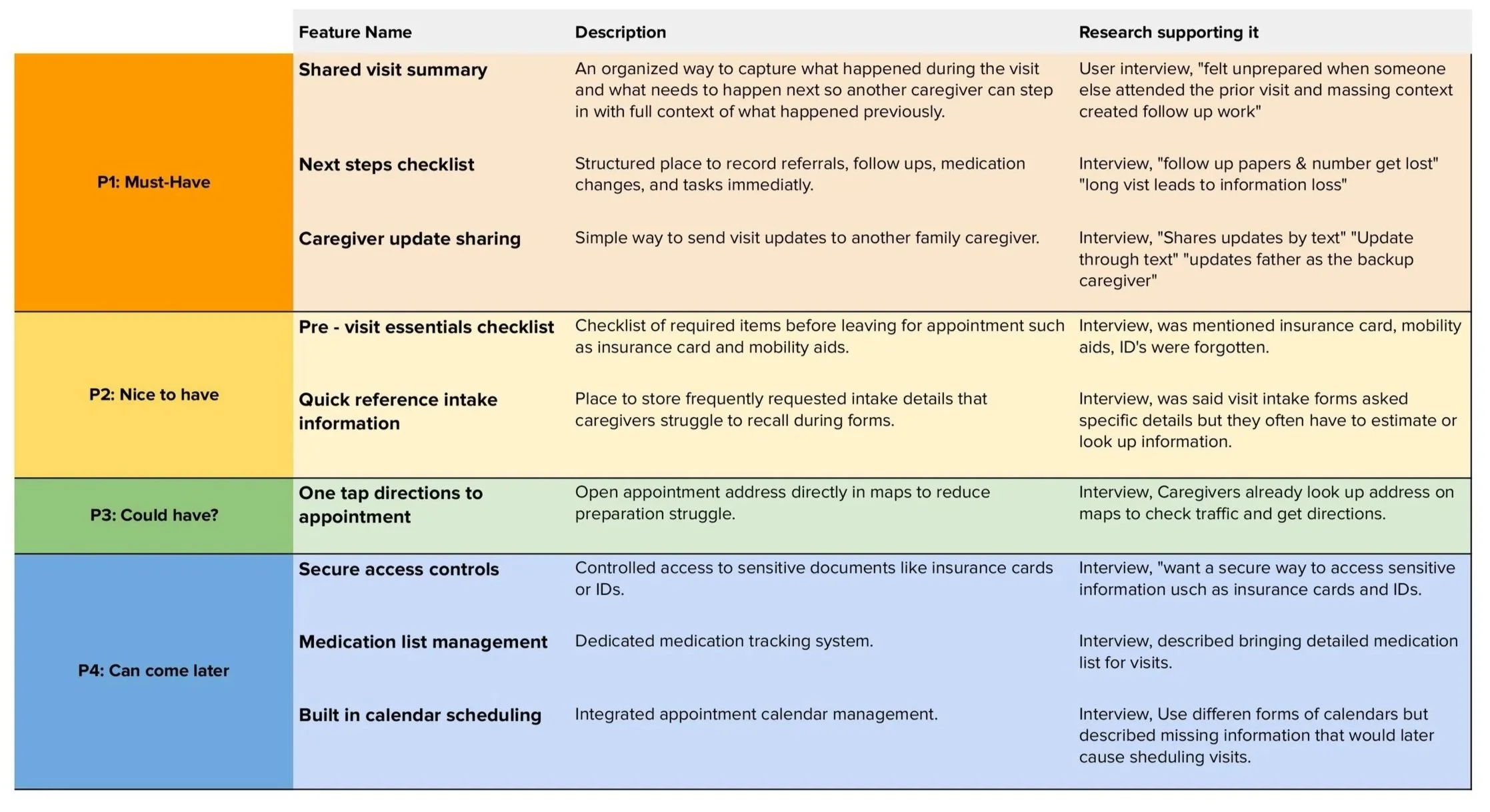
Feature List
From Goals to Functionality
To meet both user and business goals, I prioritized a event layer button, quick smart filter, event cards, and remind me feature. These are features that directly tie user value to measurable engagement for Google.

User Flow
A Simple Path to Discovery
Before jumping into wireframes, I mapped the ideal user journey to ensure the feature felt simple and intuitive. The users wanted a quick solution and this gave me an idea how to structure the user flow catered to them.

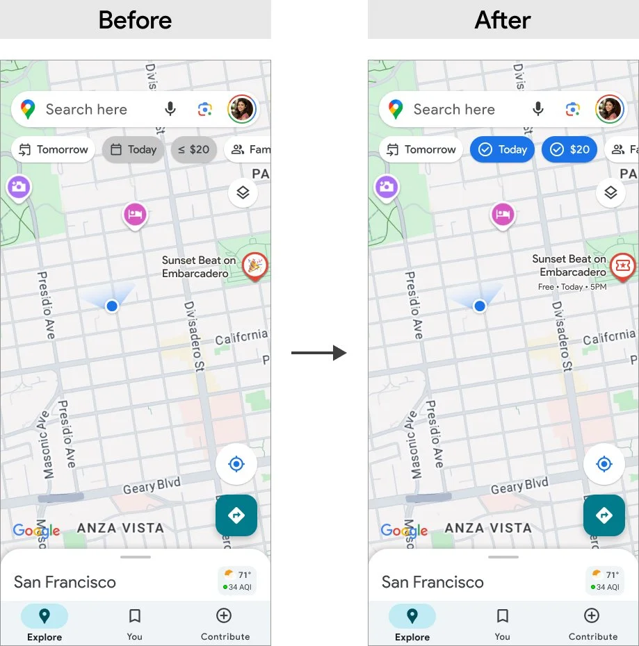
Flow:
Open Google Maps
Tap Layers → Enable Live Events
Apply filters like Today and ≤ $20
Tap a pin to see event details
Navigate
This user flow anchored the design process while ensuring every screen supported the goal of finding and attending an event quickly.
Design
From Sketch To Structure
With the paper wireframes I explore early ideas for where filters, event pins, and cards could live on the screen. This gave me the freedom to sketch quickly and try different styles without overthinking the details.
I moved into mid-fidelity wireframes to test the overall flow to focus on actions like turning on the Live Events layer, applying filters, selecting a pin, and starting navigation. I then built the high-fidelity mockups using Google’s Material Design system, which brought a sense of polish and realism. This stage included adding filter pills and event category icons that made the experience feel a bit more complete and ready to use.


User Testing
What Worked and What Didn’t
I conducted moderated usability tests with five users representing students, professionals, and a parent. They completed all tasks successfully, from enabling the layer to starting navigation.
Some users missed the horizontal scroll on filter chips.
Event pins felt vague without categories.
Price needed to be visible earlier in the flow.
Feedback:
100% task success (25/25 tasks)
Median flow time: 53 seconds
Average SEQ rating: 4.2/5
Key metrics:

“This feels faster than Eventbrite.”
Design Iterations
Refining for Clarity
Based on user feedback, I made key changes:
Strengthened filter pills states with checkmarks and bold colors.
Added price tags directly on map pins.
Introduced icons for event categories (music, food, art, family)
Auto displayed the crowd meter.

Final Design
A Seamless Discovery Experience
The final version integrates live event discovery into the Google Maps ecosystem without disrupting familiar interactions. It empowers users to explore what’s happening now, whether they’re looking for a casual street fair or a late night music set.
Home mockup - Starting point on the familiar map.
Layers mockup - Toggle on the Live Events layer.
Live Events + Filters mockup - Refine results instantly with chips.
Event Card mockup - See time, price, and crowd at a glance, then start navigation.
The result is a fast, friendly, and functional solution that makes event discovery feel like second nature.

Product Success
100% task success
Average flow time: 53 seconds
SUS score: 84 (Excellent)
Every participant said they’d prefer this experience over Eventbrite or Instagram for discovery.
Impact Statement
Connecting User Value to Business Growth
The Live Events layer demonstrated how Google Maps could capture moments, not just places. In testing, participants completed tasks in under a minute, preferred it over Instagram or Eventbrite, and said they would actually use it on weekends. For Google, this meant a clear path to increasing weekend engagement and opening new revenue through tickets and ads.
Point of View (POV)
Designing for People and Business Together
My POV as a designer is that great features should solve real business problems while making life easier for users. By grounding this project in both user frustrations and business opportunities, I was able to design a solution that felt native to Google Maps, delivered delight for users, and aligned with business growth.
What I Learned
Designing for Real Behavior
This project really showed me how to quickly test assumptions, catch small pain points, and design while staying within system constraints. More importantly, it reminded me that UX has the biggest impact when it balances both user needs and business goals at the same time.
The biggest takeaway for me is to always check myself with one key question:
Does this help the user make a decision faster while helping the business grow?